8 Ways to Increase Conversions within your Landing Pages
Justin Stauffer Boomer Marketing, Creative That Sells, Digital Direct Marketing, Health Care Marketing, Insurance Direct Marketing, Marketing Analytics, Medicare Marketing, Response MarketingHere’s a sobering fact:
Statistically, 96% of the traffic that visits your landing page leaves before they take any action. A measly 4% of your audience determines whether or not your marketing campaign is a dud!*
(*in healthcare marketing it’s closer to 3%! Ugh!)
As Medicare health plan marketers, we must entice as many people as we can to sign up, call, provide their contact information — and ultimately enroll.
Here are 8 best practices for conversion rate optimization within lead generation-oriented landing pages.
1. Know your audience
A few years ago, HubSpot surveyed over 4,000 organizations and found that the more landing pages they had, the more leads they were able to generate. This should be common sense – more opportunities to convert should correlate to more conversions, right?
But how do you know what to offer?
It’s time to think like a user! What information do they look for before ultimately becoming a member? Build your strategy around pages with the specific offers that mean the most to your audience. Medicare guidebooks, checklists, and other downloadable assets are a low-commitment way to generate leads. Offering a seminar sign up is another way to gather more qualified leads and promote event attendance.
Lastly, don’t overlook the opportunity of providing your content within another language beyond English. Display content directed to that user within their native language.
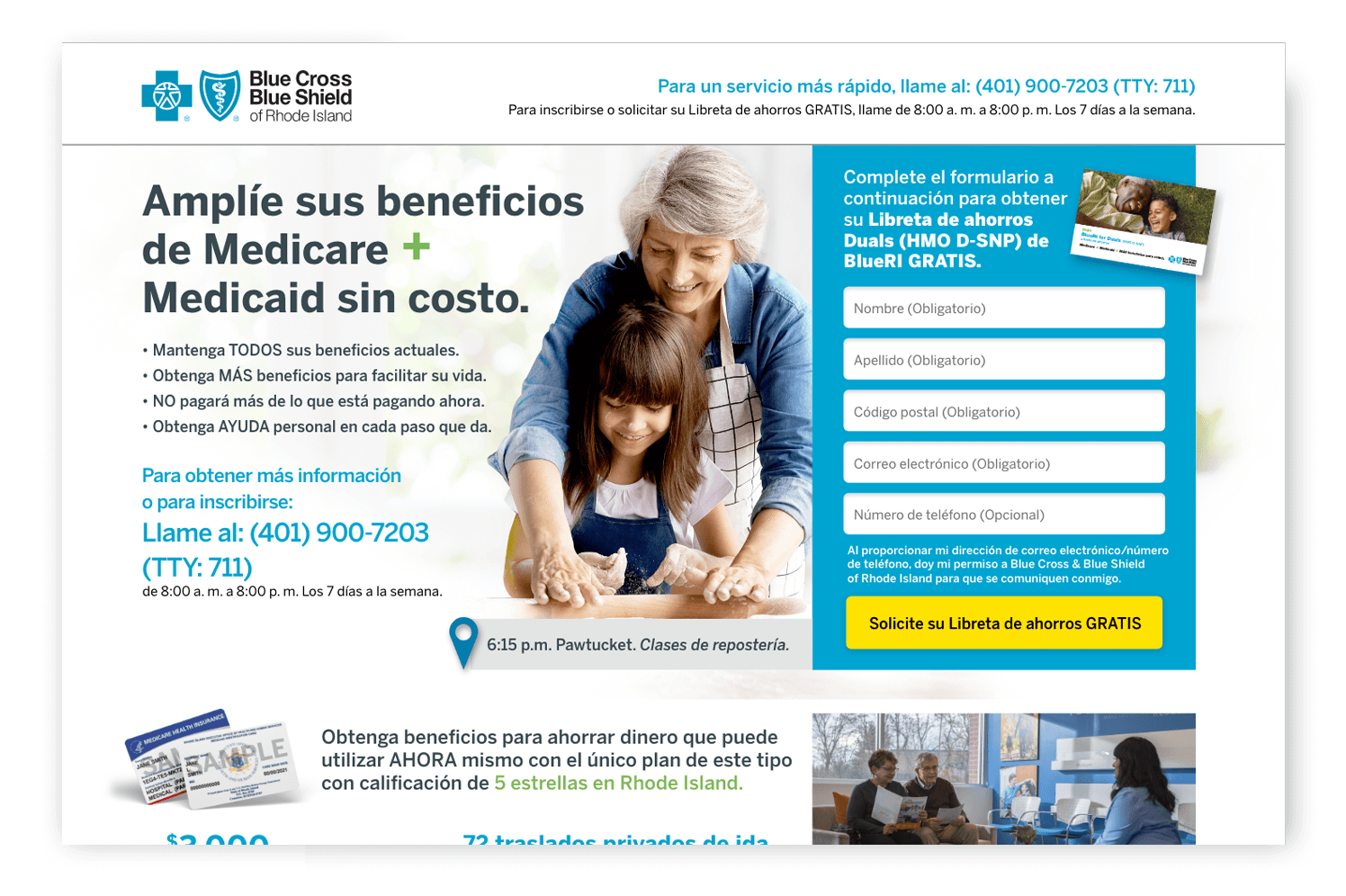
The transcreation of landing page content effectively engages prospects in their native language.
2. Feature an engaging messaging
According to Copyblogger, 80% of your visitors will only ever read a headline. On the web, a copywriter’s most difficult task is saying what needs to be said using the least number of words possible. Beyond being brief, messaging within your page should be straightforward, engaging, and relevant. Of course, it always helps to tap into a user’s pain points too!
3. Get to the point quickly
Within a website, the objective is typically to provide comprehensive information. Here, you can tell an in-depth story. Within a landing page, that’s not the case. Get to the point quickly and remove any distractions. For instance, a landing page shouldn’t typically feature navigation – limit your users’ ability to wander. Provide all necessary options to convert directly on the page.
Make sure the most important information is “above the fold.” Provide a clear path for the user to get what they came for. Secondary information belongs below the fold. It includes additional persuasive content, like key plan benefits or member testimonials.
Several years back, author Steve Krug wrote a fantastic book on this topic as it relates to web usability appropriately entitled Don’t Make Me Think — enough said!
4. Utilize clear, compelling CTAs
A landing page has a singular goal — driving conversions — although, of course, that conversion-related goal may differ by organization.
The CTA is responsible for this. Arguably it’s the most important feature within your page. CTAs should be big and prominent. They should be above the fold. They should be visually distinct from the rest of the page. Lastly, they should be easy to read and clearly describe what will happen next.
… it’s the most important feature within your page. CTAs should be big and prominent.
These factors are all even more crucial given that the primary visit originates from a mobile device. This is one of the biggest mistakes when it comes to CTAs – designing them based on desktop usage.
Several years back, Google released a Mobile-friendly testing tool that could help in reviewing CTA placement, amongst other things. Check it out: The tool is still very relevant today.
5. Create simpler web forms
As it specifically relates to lead generation, every additional informational field to fill in provides one more opportunity for a prospective lead to exit without converting.
Because a marketing lead is typically performing research, ask for the most basic information required in order to capture a lead. At DMW, our viewpoint is to require minimal information to have an actionable lead. This is typically a First Name, Last Name, and a combination of either phone number or email address. Each additional field risks alienating the potential lead.
There may be times when adding additional fields is necessary to further qualify your leads – even if it means a reduction in lead volume. Otherwise, remove all unnecessary fields – simply ask for information within follow-up messaging or on a phone call.
Years back, Expedia famously tested this theory by removing the “Company” field within one of their forms and saw a $12mm profit at the conclusion of the test.
6. Showcase errors clearly
How many times have you filled in a contact form, and nothing happened? Or you’ve spent several minutes filling in a contact form only to find that there were several errors on the page. You were probably frustrated, right?

Even if you have a “clean” design, errors will occur – users will make mistakes. The key is how easy it is for them to recover from these errors.
Inline validation is an easy way to inform the user of their errors immediately so that they may correct them on the spot – instead of waiting until they hit the ‘submit’ button. So much has been written about best practices for inline validation. Nearly 15 years ago, this article was written specifically about the practice. It’s still required reading for digital designers today!
7. Make sure your page loads quickly
According to recent research by Google, bounce rate increases by 32% when a page load time went from 1 to 3 seconds, and by a whopping 90% when the page load time went from 1 to 5 seconds. If a site takes up to 10 seconds to load, then the chance of a bounce increases to 123%. Google also offers a free tool to measure PageSpeed.
Here are some things you can do to improve your page’s loading time:
- Compress and optimize your images
- Minify HTML, CSS and Javascript requests
- Enable browser and page-level caching
- Don’t use unnecessary plugins, script or pixels
- Choose a better performing hosting provider
8. Continuously test and optimize
Once your page has been launched for a period of time, consider performing a series of on-going, incremental (and simple) changes to the page and then determining what worked versus did not work. This is called A/B testing.
I far prefer A/B testing to multivariate testing because singular changes are far easier to quantify than several changes. Small revisions may include testing the location, colors or prompt within your CTA. Other tests may include changing the headline, subtracting form fields, changing imagery.
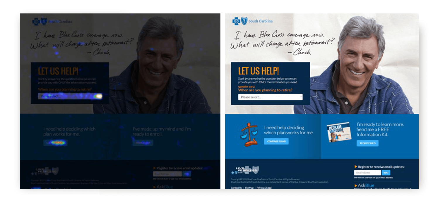
A snapshot of how users are interacting with your page can lead to effective optimization.
Beyond merely using analytics, I prefer to test based on user behaviors. Tools like CrazyEgg can help determine where people click on a given page as well as where they scroll to before exiting the page. Use this information to further support your A/B testing strategies.
Simple, right? You can rely on DMW to implement every best practice listed here. For more expertise, experience, and insight, check out our other blog entries or get in touch with us today!